A product page is not “description + price”. It’s a complete decision-making journey: from first impression, through trust and risk reduction, to answering last-minute doubts and triggering the final click on “Add to cart”. When any single segment is weak, customers don’t just “not buy” — they postpone the decision or leave to compare elsewhere.
Below, I break the product page down into practical segments and explain why each one matters for sales. In key places, I link to concrete implementations as examples — so you can see how a given segment can be executed in Magento 2.
1) The "first 3 seconds" segment: attention, orientation, and a reason to stay
Users don’t read when they land on a product page — they scan. In the first seconds they try to answer three questions: “Is this what I’m looking for?”, “Is the offer attractive?”, and “Does this store feel trustworthy?”. That’s why the key information must be immediately visible: product name, price, variants, availability, and short signals that reduce uncertainty (e.g., New, Bestseller, Sale, 24h shipping).
This is where micro-messaging layers work extremely well, such as product labels . Their job isn’t just to look nice — it’s to guide attention: they highlight what matters, what’s a deal, what’s a safe choice (social proof), and what’s limited (urgency).
2) The decision segment: the call to action and "proof points right next to the button"
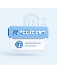
The “Add to cart” button is the climax, but it rarely works alone. Near the CTA, users look for confirmations: delivery details, returns, warranty, and a short “what exactly am I buying?” summary. If those details are buried in a long description or a tab at the bottom, people won’t scroll — they’ll abandon.
That’s why a concise text block under the “Add to cart” button works so well: a few lines that close doubts before they fully form. In practice, this is where you place what truly sells (not an encyclopedia of features).
3) The "will it fit?" segment: sizing, fit guidance, and fewer returns
In many industries (fashion, footwear, accessories, technical products), the biggest barrier isn’t price — it’s the risk of a wrong choice. If users aren’t sure they’re selecting the right option, they’ll buy later… or not at all. And if they buy wrong, returns are likely.
The strongest tool here is a clear, easy-to-access size chart , placed where users actually need it (close to variants/options). A well-designed fit segment reduces support questions and, most importantly, cuts the cost of returns.
4) The variants segment: choice without friction and without losing the user
Variants (color, size, version, capacity) can kill conversion if users don’t understand how to switch options or feel like they’re looking at “different products”. The variants segment should be simple: I see options, I see differences, I know what I’m selecting.
Depending on your catalog strategy, you may want a way to present product variants without a classic configurable , so customers move through a “product family” intuitively, without confusion. The key is predictability: choosing a variant shouldn’t feel like a leap into the unknown.
5) The trust segment: "is this store legit?"
Trust is the currency of e-commerce. Users often buy not when they’re amazed, but when they stop fearing risk: payments, delivery, returns, claims, scams. Product pages should visibly include signals that normalize the purchase: familiar payment methods, clear rules, and recognizable cues of reliability.
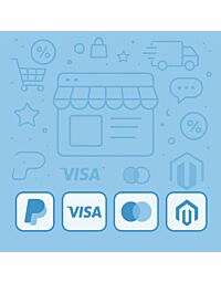
One of the most underrated trust builders is payment icons on the product page . This isn’t decoration. It’s a direct message: “you can pay conveniently and safely” — and in many markets, it shortens the decision cycle.
Another trust signal is brand presence outside the store, for example links to social media profiles . People often click not to follow — but to verify the company exists, has history, and is reachable.
6) The objection-handling segment: questions, service, warranty, and "what if something goes wrong?"
With higher-ticket (or simply more complex) products, the barrier isn’t lack of interest — it’s lack of answers: compatibility, installation, service rules, warranty terms, spare parts, lead times, and expert guidance. If the product page can’t capture these objections, users move the decision into email or phone… or they go to a competitor.
This is why an on-page mechanism like “Ask about a product” is so effective. Customers don’t need to search for contact details or copy links — they ask in context, at the moment of doubt, where the chance to close the sale is the highest.
And if you sell products where warranty and service are critical, the page should automatically communicate the right information — for example via manufacturer-based service information . It works like a “risk reducer”: customers feel they won’t be left alone after purchase.
7) The content segment: information architecture instead of a wall of text
A long product page isn’t a problem. Lack of structure is. If content is a single uninterrupted column, users can’t find what they came for. And if they can’t find it — they won’t decide.
That’s why information architecture matters: sections, headings, tables, lists, downloadable files, and FAQ. In Magento, this is often implemented through additional product tabs , which separate “what I need now” from “what I can read later”.
8) The SEO segment: how your product page earns traffic from Google
Product-page SEO is two worlds: (1) controlling what should be indexed and what shouldn’t, and (2) how your listing appears in search results. If you index everything without strategy, Google wastes crawl budget on low-value pages (duplicates, parameters, filters). If you don’t provide structured data, you miss the chance for richer results (price, availability, breadcrumbs, and more).
The first part is intentional index control — for example via robots meta tag management . The second part is strengthening SERP presentation with JSON-LD structured data , helping search engines understand your product and offer more accurately.
Importantly, SEO is not a separate project next to UX. Clear sections and direct answers to real user questions support both conversion and visibility. Your product-page segments should reinforce each other — not compete.
9) The social share segment: how your product looks when it’s shared
Product pages live outside your store: someone sends a link on Messenger, WhatsApp, Slack, or posts it on social media. If the preview is random (wrong image, cut-off text, inconsistent title), you lose free clicks.
That’s why it’s worth controlling share metadata with Meta OG (Open Graph) . It’s a detail you don’t always notice inside the store, but it can strongly influence clicks from shares.